Green & Black’s office, Berkeley Square
When chocolate brand Green & Black’s moved into new West End offices, it wanted a hallmark site that reflected its organic and ethical brand, while owner Cadbury Schweppes required a corporate office for itself.
Key Facts
Project: Green & Black’s office
Design: Scott Brownrigg Interior Design
Fit out: Interior Dimensions Contracts
Size: 465 sq m
Completion time: 24 weeks
Project Description
When chocolate giant Cadbury bought its organic rival Green & Black’s in 2005, the plan was always to run it as a standalone company, preserving the strong brand that had helped make Green & Black’s the UK’s fastest growing confectioner.
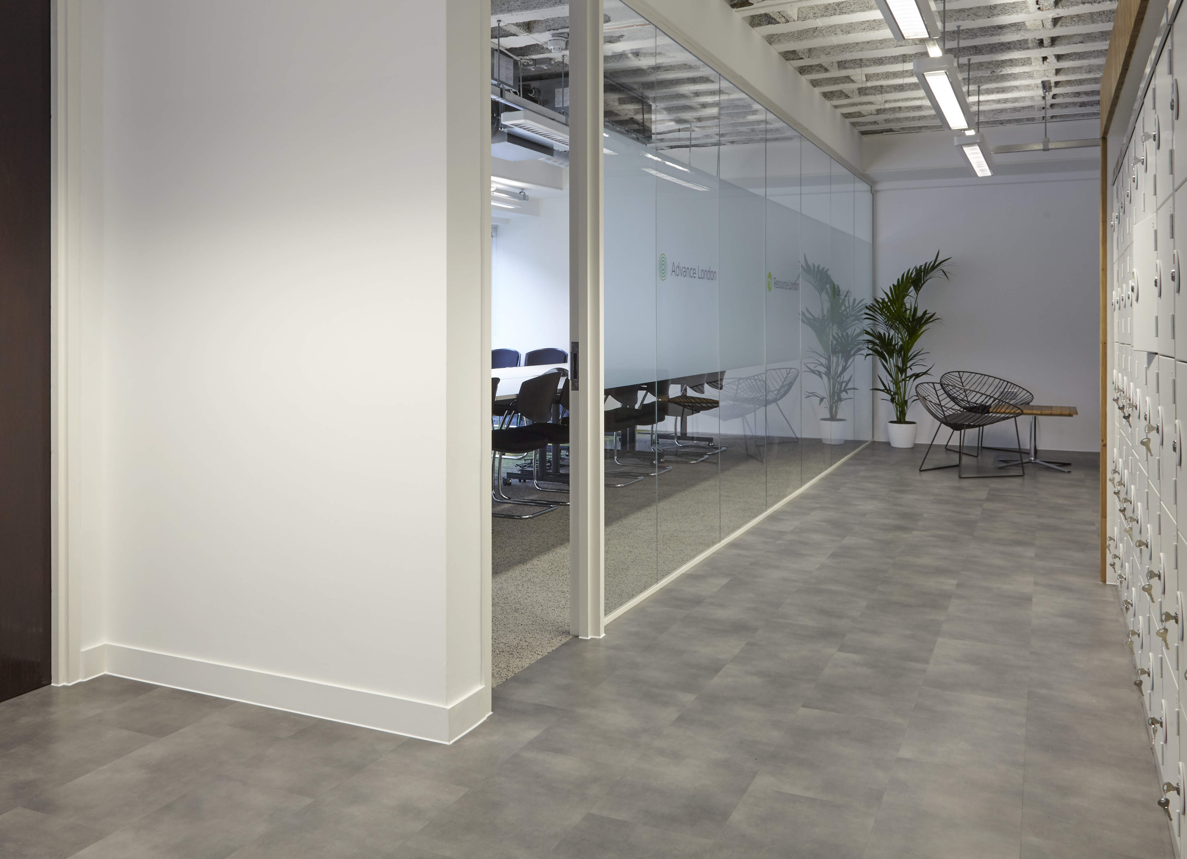
A recent office renovation project saw Green & Black’s move its global office for marketing and innovation from Waterloo to a Grade II listed building in London’s prestigious Berkeley Square, but the space also had to accommodate a West End office for parent company Cadbury Schweppes. Scott Brownrigg Interior Design was brought in to make sure that each company’s needs were met perfectly.
‘Each company wanted quite different things,’ explains Scott Brownrigg designer Cristiano Testi. ‘Cadbury was after was an elegant, neutral, traditionally corporate fit-out, while Green & Black’s wanted something a bit more interesting in terms of interior design.’
‘We held several meetings at Cadbury’s Uxbridge offices and there they have lots of warm but quite neutral tones – beiges and greys – which are colours we’d introduced into the base-build scheme already.’
Cadbury is well known for its branding, such as the iconic purple which instantly brings to mind its Dairy Milk bar and the recent hugely successful television adverts, but as Testi explains, the company wanted a more restrained scheme for this new office.
‘At the Uxbridge office there’s lots of branding, lots of purple and lots of gorillas playing drums all over the place, but for Berkeley Square, they asked us to keep some of the same colour palette, but to keep it quite neutral. So it was quite a simple brief: understated and elegant,’ he says. Green & Black’s occupies most of the space, with both companies sharing the breakout area.
‘The Green & Black’s side was quite clear: they told us how many desks they wanted and that they required a spacious reception area and a generously sized breakout space. One of the more unusual things they asked for was a chocolate tasting room,’ says Testi.
Each of these areas had to represent the Green and Black’s carefully honed brand. ‘Green’ represents the brand’s commitment to producing all its chocolate according to Fairtrade guidelines, while ‘Black’ is a reference to the original 70 per cent cocoa dark chocolate bar and, unsurprisingly, these colours have been used extensively.
‘Green & Black’s wanted to make the most of the period features of the building. That’s what brings the sophisticated “black” element to the building,’ says Testi. The project involved the careful refurbishment of a grand reception area with ornate columns, covings and mouldings. This area was subtly brought up-to-date with a new stone floor, suspended chandeliers and soft furnishings. ‘We wanted to marry this with the “green” element, which is very organic looking, a very natural-looking aesthetic,’ Testi continues.
The design had to do more than look natural, though. ‘Given the company’s commitment to Fairtrade and organic farming, it was a given that we would use sustainable materials wherever possible,’ says Testi. ‘For instance, the carpets, which have that chunky, organic sort of look, are from Interface Flor, which has great green credentials – it’s Cradle to Cradle certified – so it ticks all the boxes.’
Recycled and natural materials have been used to great effect throughout. The reception desk is clad in coconut shell, which has been bonded to plywood and smoothed flat. The Green & Black’s logo has been stencil-cut from the shell.
Low-level illuminated banquette seating is upholstered in Camira fabric, which is woven from nettle fibres, and clear screens, which divide the reception, breakout space and the main office area, contain real grass sandwiched between layers of recycled acrylic.
The kitchen area has a bright, lime-green splash back, walnut units and a cream coloured stone worktop, which perfectly evoke the Green & Black’s brand.
The same Teknion workstations that Cadbury uses in its Uxbridge office were chosen for new desking. ‘Teknion has quite a strict environmental policy so that fitted with Green & Black’s,’ says Testi.
So what’s the most successful element of the project? ‘I think the reception and the breakout space work really in terms of branding,’ says Testi. ‘At the beginning of the project we were given the Green & Black’s brand bible, which explains the history of the company and the brand, and I think the reception is very successful in translating that brand into interior design.
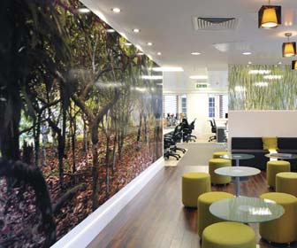
‘The breakout space has lots of warm natural tones and natural timber and there’s also that splash of lime green, which gives it a bit of vibrancy. Also, against the wall of the tasting room there’s a full-size image from of a jungle in Belize, where the company has a cocoa plantation. It’s a real reminder of where the product comes from and makes you feel like you’re right there in the jungle.’
Project Suppliers
• Interface Flor-www.interfaceflor.co.uk
• Quadrant-www.flooring-company.com
• Amtico-www.amtico.com
• CTO Lighting-www.cto-lighting.co.uk
• Deltalight – www.deltalight.com
• Dulux – www.dulux.co.uk
• Material Solutions – www.materialssolutions.co.uk
• Concept Tiles – www.concepttiles.com
• Strata Tiles – www.stratatiles.co.uk
• Altro – www.altro.com
This article was first published in FX Magazine.